Get in touch with Guangzhou Toplay amusement equipment co. Company

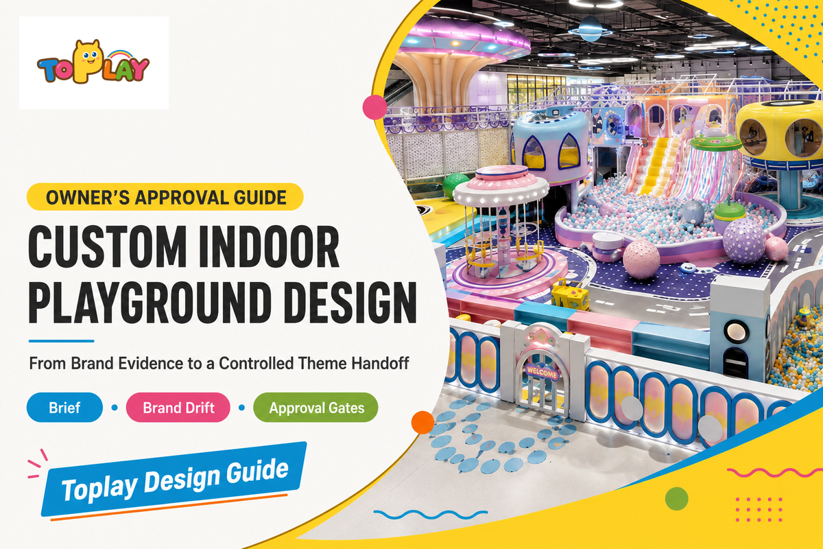
Updated September 2026
Custom indoor playground design is the owner-led process of turning brand evidence into visual rules before imaginative graphics or indoor playground equipment choices are fixed; related search language includes “indoor playground design ideas,” “indoor play area design,” and “indoor play area design ideas.” An owner needs their brand positioning, evidence pack, and a way to approve decisions without confusing taste with strategy. Even with a polished render, something that may look appealing can become indistinguishable from the competition after the logo is removed.
This guide covers the owner-side creative process. It includes translating brand evidence into visual language, assessing conceptual routes, identifying brand drift, maintaining consistency, and packaging creative assets for sign-off. It does not estimate project cost, plan the floor, select equipment, or verify compliance with engineering, safety, accessibility, legal, manufacturing, fire protection, or other applicable standards. However creative the initial render may be, equipment selection and applicable standards remain decisions with separate owners.
The short version
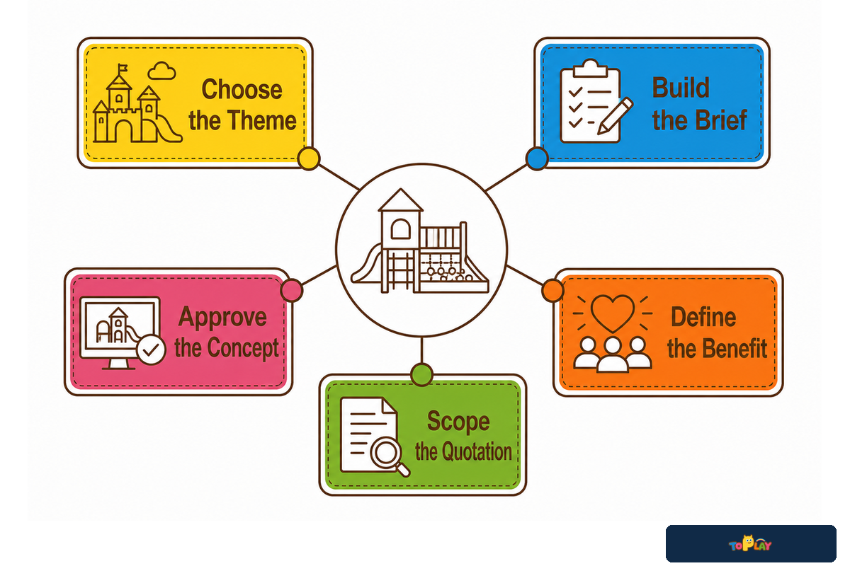
Freeze the brand position, complete the 12-input pack, define six families of visual rules, compare three concept routes, and release the choice through four approval gates. If a creative choice affects access, routes, play components, signs, sensory choice, structure, egress, or materials, route it to the appropriate professional review before release.
1. Decide Which Design Problem This Guide Owns
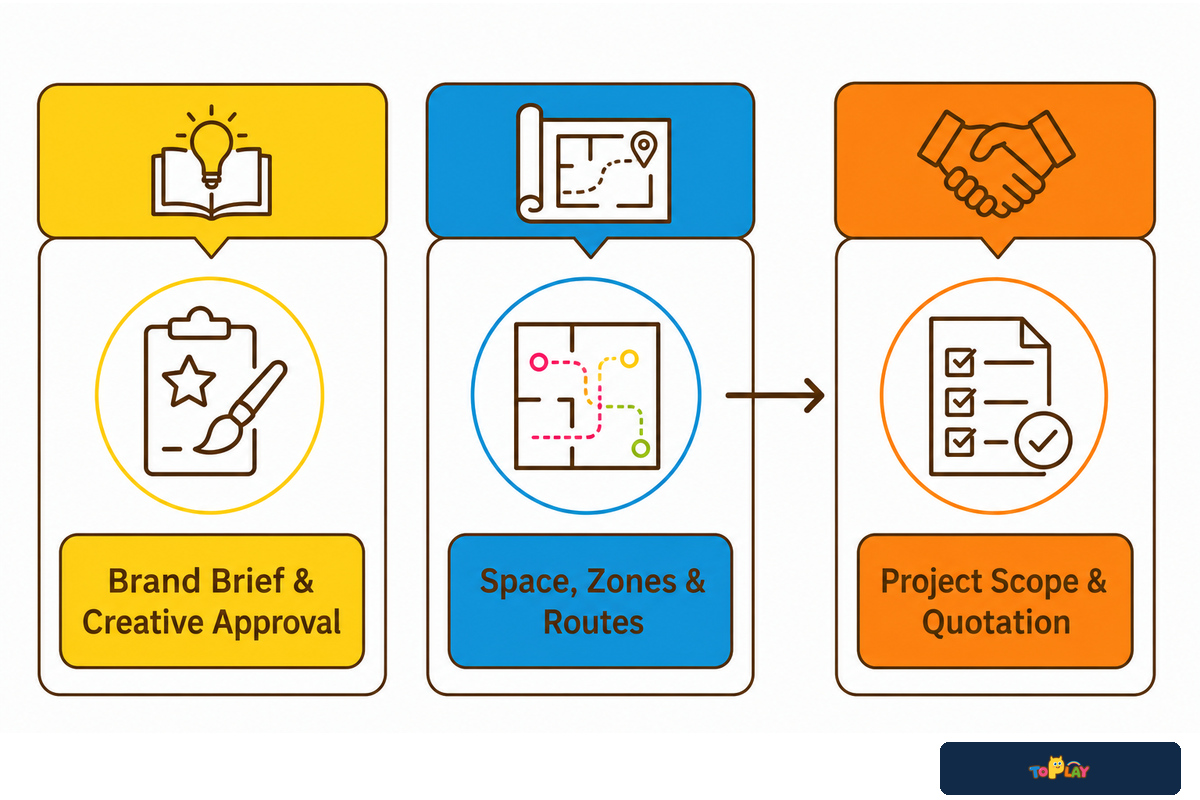
Three pages can cover indoor playground design, and this article won’t cover the same ground; however, this article should prepare the owner and give them the ability to understand brand-to-theme direction. Toplay’s indoor playground space-planning guide offers a detailed review of the site brief, usable footprint, zoning, adjacency, circulation, and spatial layout. The custom theme and brand design service Page owns project-specific deliverables, playground equipment and material decisions, schedules, commercial terms, and quotation.
The 3-Owner Content Map
| Content owner | Question it answers | What stays elsewhere |
|---|---|---|
| This guide | What brand evidence should we supply, and how do we judge the concept? | Price, equipment, spatial layout, technical approval |
| Space-planning guide | How should the site, zones, and routes be planned? | Brand position and creative approval |
| Commercial service Page | What can be designed for this floor plan and quotation? | General educational methodology |
Creative sign-off is a conditional approval. Any route, component, sign, structure, material, or egress dependency stays open until its responsible professional reviews it.
2. Start With a Brand Position, Not a Theme Name
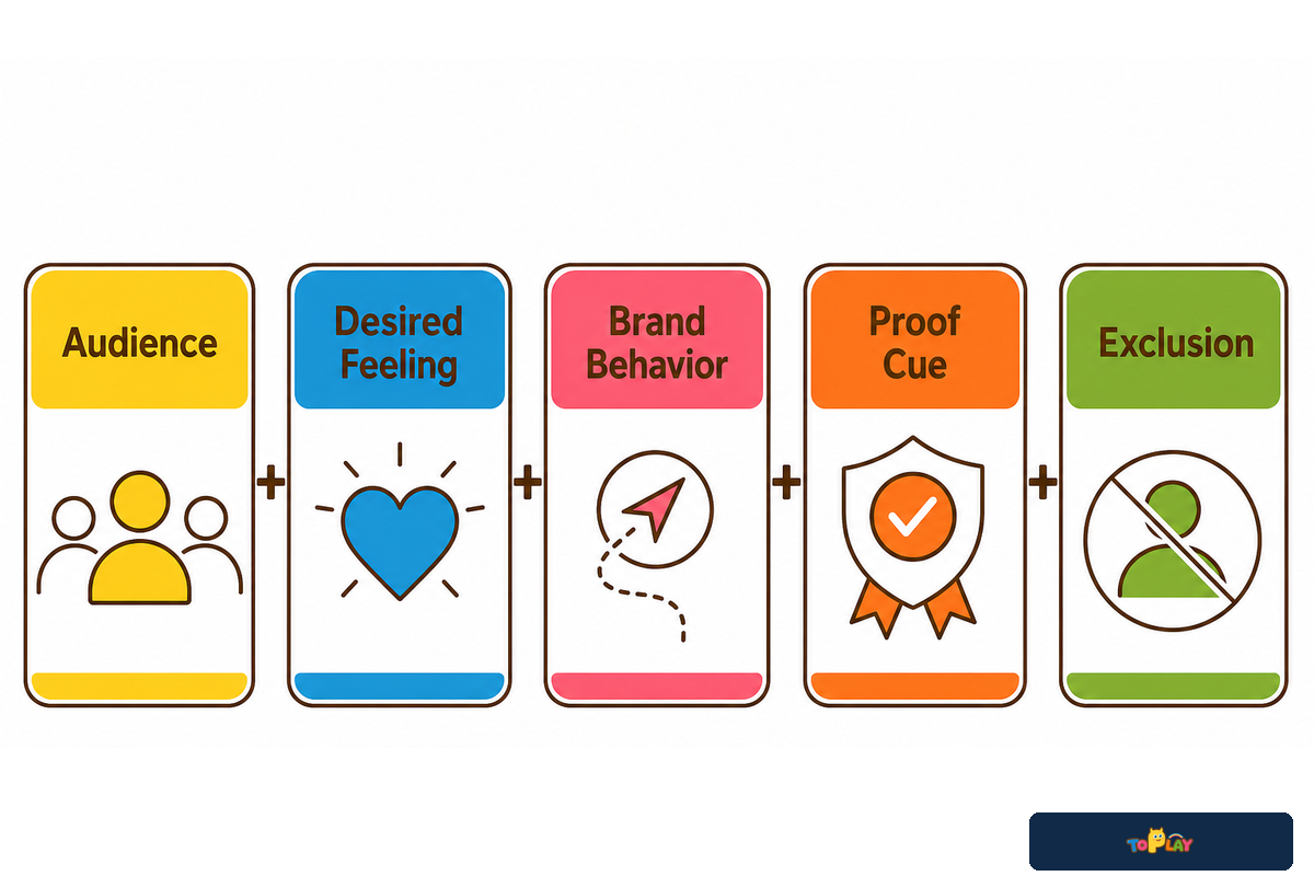
With the ownership boundary clear, the theme becomes an output rather than the starting point. Brand positioning defines what the venue means to a particular audience and preserves recognizable behavior when the backdrop changes. Before requesting concepts, write one sentence with five parts: audience, desired feeling, brand behavior, proof cue, and exclusion.
For instance: “For families with children who enjoy self-directed discovery, the venue should feel curious rather than chaotic, using layered clues and friendly surprises while avoiding aggressive competition and babyish decoration.” This sentence doesn’t imply a visual theme. For example, a jungle route could use specimen labels and hidden tracks, while a space route could use mission clues and discoverable constellations. Both could express curious discovery if their decisions are traced to the same position.
Do
- Describe the audience outcome
- Name the behavior the brand rewards
- Record cues that would prove the position
- Write explicit exclusions
Do not
- Start with a popular image category
- Use “fun for everyone” as the entire brief
- Treat the logo as the only brand evidence
- Approve a mood board without constraints
The practical test is simple: can two different visual worlds express the sentence without changing its meaning? If yes, the team has a position. If only one collection of images works, the brief is probably describing a style rather than the brand.
3. Build the Brand-to-Theme Input Pack
The Brand-to-Theme Input Pack turns the approved position into an original worksheet that shows what evidence the designer can use. It isn’t a safety checklist or an industry standard. Each row needs one of four statuses: approved, reference-only, missing, or prohibited. “Reference-only” is important because an image may communicate tone without allowing the project to have the right to copy it.
| Input category | Filled example | Status / owner |
|---|---|---|
| Brand position | Curious discovery without competitive pressure | Approved / founder |
| Audience and representation | Family segments; feedback source from caregivers and intended users recorded | Missing / research lead |
| Desired feeling | Inviting, discoverable, calm at first view | Approved / brand lead |
| Brand behavior | Invite exploration through clues and choices | Approved / brand lead |
| Palette hierarchy | Yellow lead; blue support; pink, orange, and green as limited signals | Approved / design lead |
| Typography | Display and information typefaces with licensed files | Missing / rights owner |
| Shape and pattern cues | Rounded discovery windows; dotted trail pattern | Reference-only / design lead |
| Imagery rules | Objects invite questions; no stock-character collage | Approved / brand lead |
| Character assets | No character approved for the first concept round | Prohibited / founder |
| Naming voice | Short action phrases, not fantasy lore | Approved / copy lead |
| IP and usage rights | Owner, territory, media, duration, editable-file rights | Missing / procurement |
| Approval owner | One person accepts or rejects each requested decision | Approved / project sponsor |
The pack is ready for concept work when missing rows are resolved or carried forward as named assumptions. It fails when the team treats reference material as approved artwork, leaves rights ownership unclear, or asks people to review decisions they do not own.
4. Turn Brand Assets Into a Visual Grammar
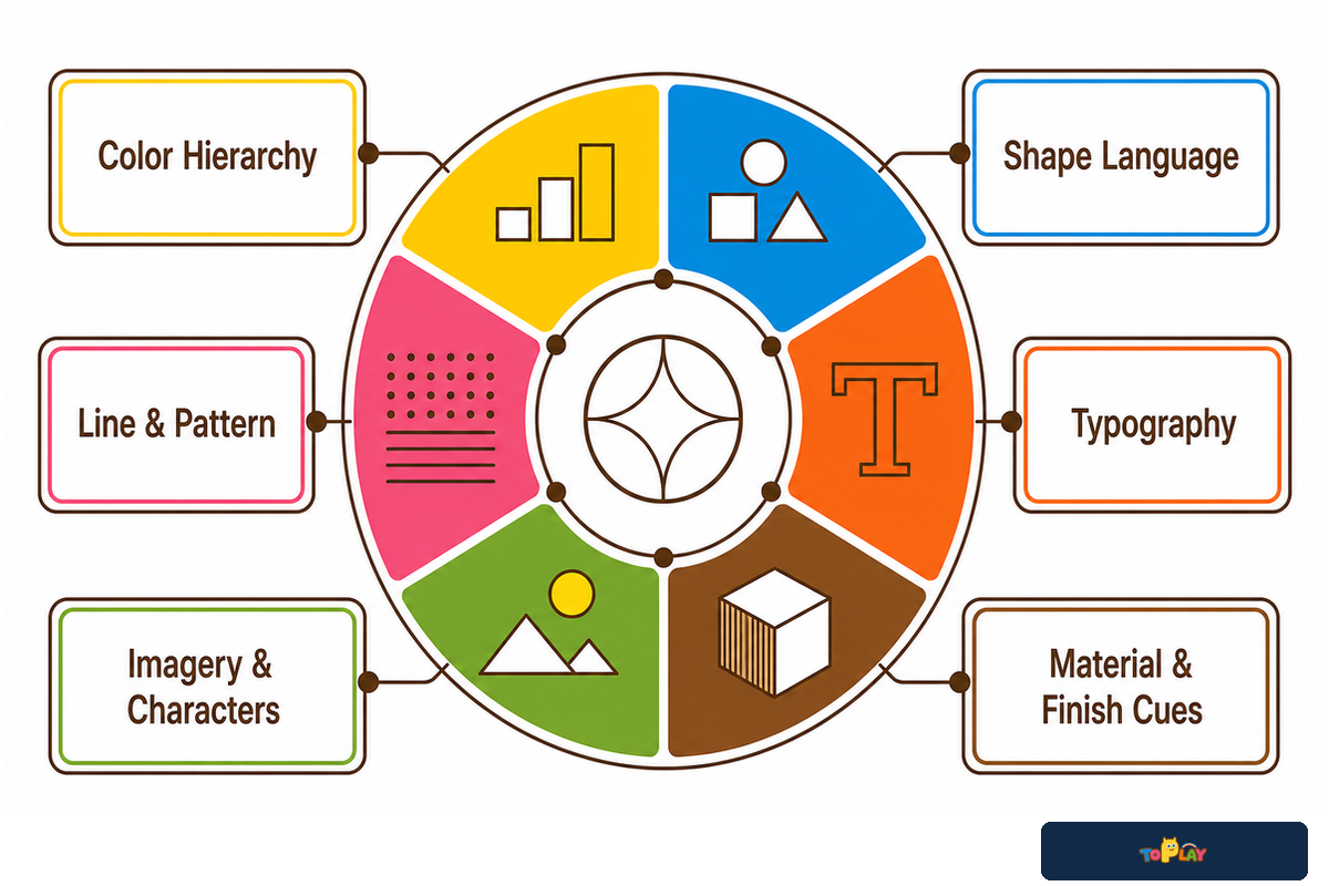
Visual grammar is the system of rules that makes separate design applications feel related. A 2025 review of experiential graphic design analyzed 245 records across three research databases; its final review included 28 publications. The paper treats the field as the visual expression of ideas in built space, not as a logo-placement exercise.
A separate systematic review published in 2026 analyzed and selected 85 primary studies on inclusive graphic design. The evidence is predominantly focused on visual communication and digital contexts. Thus, it can’t validate the outcomes associated with an indoor playground. However, it presents a valuable review framework:
“Their findings highlight the importance of applying coherent visual principles, clear hierarchies, relevant multimedia elements and consistent information structures.”
2026 systematic review of inclusive graphic design
| Cue family | Define | Avoid |
|---|---|---|
| Color hierarchy | Lead, support, signal, and neutral roles | Every color at equal intensity |
| Shape language | Two or three repeatable silhouettes | Unrelated decorative shapes |
| Line and pattern | A pattern with scale and density rules | Filling all empty surfaces |
| Typography | Display, instruction, and label roles | Decorative type in information tasks |
| Imagery and characters | Purpose, pose, cropping, and rights rules | Unowned or style-mixed artwork |
| Material and finish cues | Desired visual impression and approved references | Pretending a creative reference approves a technical material |
For each family, establish a primary, secondary, neutral, prohibited use, and legibility rule. The legibility rule is an escalation point where a designer can propose the creative intent, but a decision that affects a required sign, component, route, finish, or material requires the input of the relevant professional.
5. Compare Three Concept Routes Before Choosing One
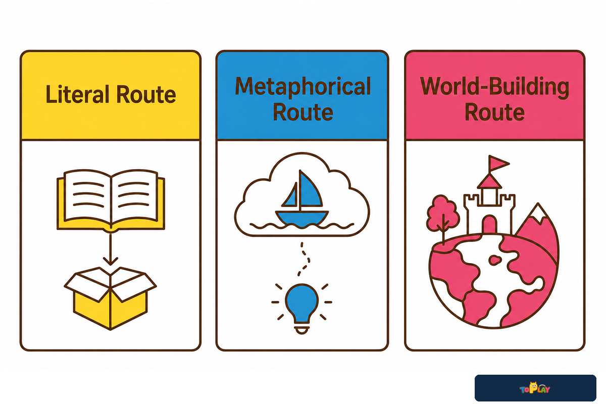
Compare the routes before render quality decides the meeting. Ask every route to express the same brand position with the same evidence pack. The following are working choices, not a popularity ranking.
| Route | Best used when | Strength | Limitation / not suitable for |
|---|---|---|---|
| Literal | The subject itself carries the brand promise | Easy first-read recognition | Weak when competitors can use the same subject unchanged |
| Metaphorical | A brand behavior matters more than a pictured subject | More room for distinct visual choices | Weak when the connection needs a long explanation |
| World-building | Names, characters, and stories must extend across touchpoints | A reusable narrative system | Not suitable when rights, content ownership, or future maintenance are unclear |
Rate each route on brand fit, distinctiveness, extensibility, rights risk, production translation, and refresh flexibility. Don’t combine the scores into a universal winner. Rights risk can disqualify a route. Lower extensibility may be acceptable for a single-format venue. In such situations, the decision record should document the trade-off accepted by the owner.
Broad visual-design and inclusive-play sources help frame the questions, but they don’t validate outcomes in an indoor commercial playground. This comparison should be considered as an intentional creative choice. Submit the design’s physical implications to the professionals who own them.
6. Reject Generic Ideas With the Brand Drift Test
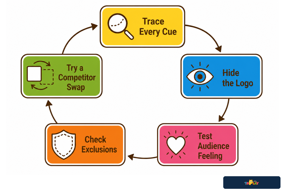
After the route comparison narrows the field, the Brand Drift Test critiques the preferred concept rather than rubber-stamping it. The input for the test is one direction, the output is whether that direction behaves like the brand that was approved. The test fails when significant signals lack a rational explanation or when the idea could be shared with a competitor with no revisions.
- Can every major cue be traced to a row in the input pack?
- Does the concept retain a recognizable behavior when the logo is hidden?
- Does it create the intended audience feeling?
- Does any cue contradict the tone or an explicit exclusion?
- Could a competitor adopt the direction without changing its central idea?
After the route comparison narrows the field, consider two concepts that both describe “curious discovery.” Concept A contains stock animal graphics, a large logo, and a jungle mural. Hiding the logo provides no clue that the discovery is the organizing principle, so the concept fails Question 2 and 5. Concept B uses a trail of visual clues, layered reveal windows, and short action names. While the discovery cues remain, no mark is required, so the concept passes the brand-fit test.
Write a redline, not a preference
Weak: “Make it more premium and less generic.” Better: “The stock animal collage has no traceable link to our discovery behavior and would survive a competitor logo swap. Replace it with one cue family that invites finding, sorting, or revealing.”
A redline identifies the rule at risk, the visible evidence, and the requested correction. It doesn’t ask a designer to “be more creative,” nor does it suggest passing the test will affect revenue or customer behavior.
7. Run a Theme Consistency Audit Across Key Touchpoints
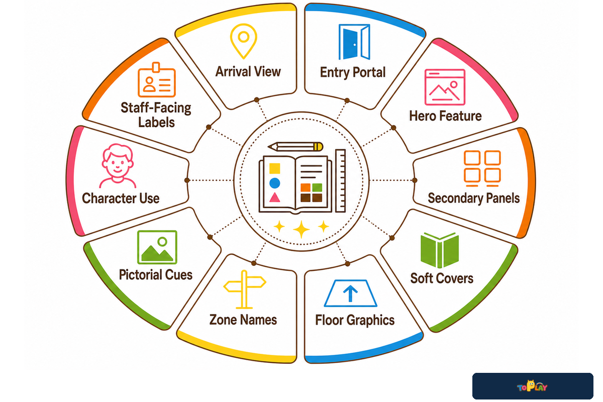
After the Brand Drift Test examines the preferred direction, the Theme Consistency Audit begins only when that direction and its visual grammar are approved. The input is a set of applications, not a mood board. The output is whether the visible shared rules remain consistent across touchpoints, and whether intentional exceptions remain interpretable.
Include five columns for each touchpoint: cue continuity, hierarchy, legibility, audience fit, and approved exception. An initial easy-to-use scale for each might be 0 for missing, 1 for partial, and 2 for clear. It’s a tool for editors and isn’t for measuring safety or accessibility and there’s no passing score. Any 0 creates a query and an owner.
| Touchpoint | Review question | Example exception |
|---|---|---|
| Arrival view | Is the main behavior readable before details? | Lower intensity at first view |
| Entry portal | Does the hierarchy guide rather than decorate? | Required information takes priority |
| Hero feature | Does it express the position, not only the theme noun? | One high-intensity focal moment |
| Secondary panels | Do patterns and imagery follow the grammar? | Reduced detail near instructions |
| Soft covers | Is color doing an assigned job? | Technical material choice overrides art reference |
| Floor graphics | Is the graphic decorative or functional? | Route decisions go to spatial review |
| Zone names | Does wording follow the naming voice? | Plain language where clarity requires it |
| Pictorial cues | Are symbols legible and context-appropriate? | Applicable sign rules override brand styling |
| Character use | Are pose, crop, and rights consistent? | Character omitted where it distracts |
| Staff-facing labels | Can staff read the information quickly? | Operational clarity over decorative type |
Sensory Trust’s inclusive-play advice recommends areas of play provision with raised levels of stimulation and areas with reduced levels of stimulation “to provide choice.” A consistent brand doesn’t require one level of colorfulness, pattern density, or sensory challenge everywhere. Different areas can use different intensity.
For covered U.S. ADA signs and accessibility symbols, the applicable requirements may be non-glare finish and light-on-dark or dark-on-light contrast. The Access Board guide also states that its standards don’t set a minimum contrast for those symbols. This is a sign-review prompt, not a global rule for every graphic or jurisdiction.
Name the persons who represented the intended users in the review. When a cue changes access, a route, a play component, a transfer system, a sign, material, play structure, or egress, stop scoring it as a visual exception and route it to the responsible professional.
8. Use a Concept Approval Gate Instead of One Final Sign-Off
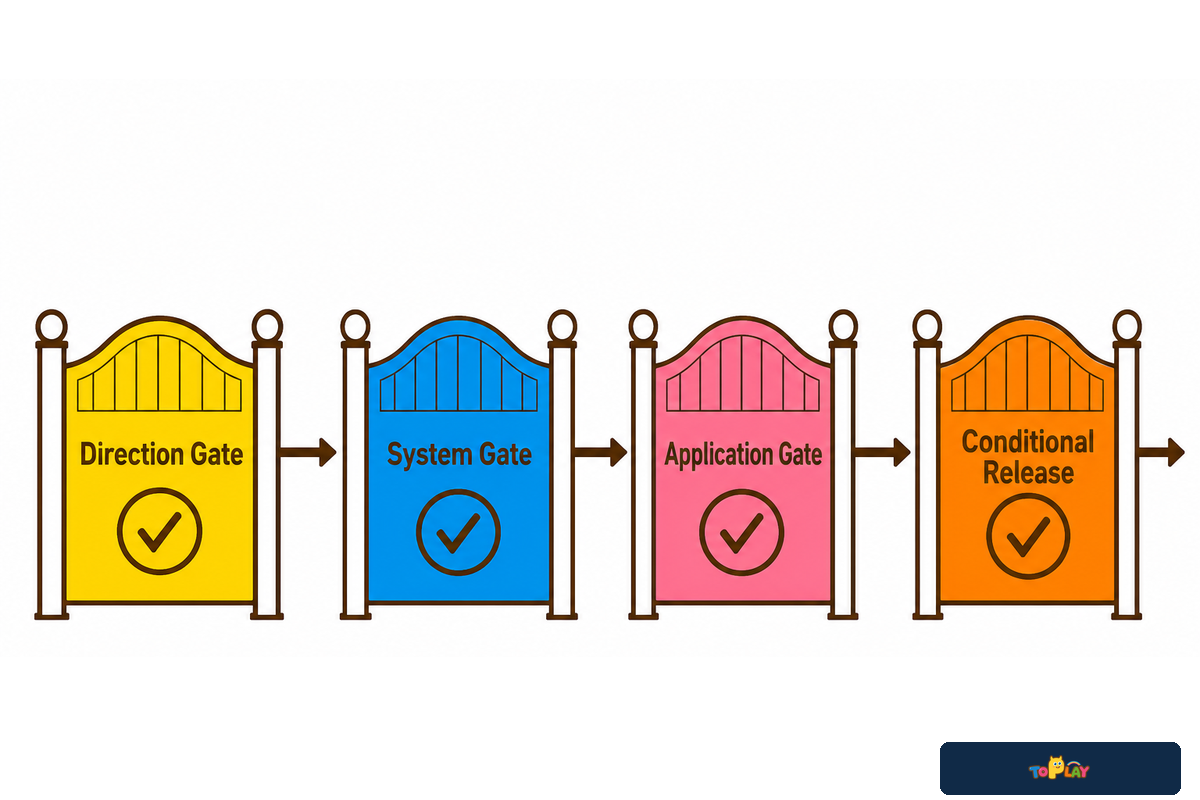
The Concept Approval Gate directs both the decision and the evidence. It doesn’t retest the fit to the brand or visual consistency on its own. Each submission needs to describe the brief, the review round, the required decision, the files included in the review, open issues, and one individual authorized to take the decision or to reject it.
1. Direction
Input: brand position and route options. Decision: select the route and accepted tradeoff. Failure: the preferred image has no traceable brand reason. Owner: project sponsor.
2. System
Input: visual grammar and rights status. Decision: approve the rule families. Failure: a core asset is missing, unlicensed, or contradictory. Owner: brand lead with rights owner.
3. Application
Input: touchpoint audit. Decision: accept applications and named exceptions. Failure: hierarchy, legibility, audience fit, or representation concern has no owner. Owner: design lead with relevant user or accessibility input.
4. Release
Input: file manifest, rights, revision status, and routed dependencies. Decision: release the creative package conditionally. Failure: an unresolved technical or legal matter is disguised as creative approval. Owner: project manager.
Keep feedback in one change set. Comments should name the rule or audience outcome at risk, show where it appears, and request a decision. “I don’t like the blue” is a preference; “the support color has replaced the lead color on seven of ten touchpoints, so the hierarchy no longer matches the approved system” is review evidence.
A gate can close its own decision while leaving another dependency open. Direction can be approved while character rights remain missing. Creative release can be ready while a sign, component, route, material, or structure awaits professional review. That conditional status is more honest than one final “approved” stamp.
9. Hand Off an Approved Creative Package
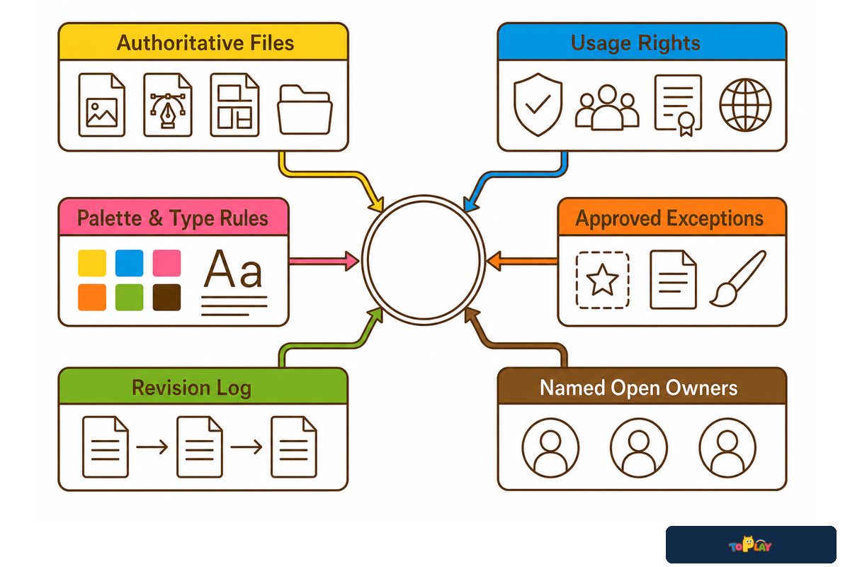
An approved package should make the current truth easy to find. Include the concept statement, asset manifest, usage rights, palette hierarchy, typography files, shape and pattern rules, imagery rules, character sheets, naming list, application examples, approved exceptions, revision log, and unresolved risks.
- Mark one file as authoritative for each asset.
- Separate approved artwork from reference-only inspiration.
- Record owner, territory, medium, duration, and editable-file rights.
- List exceptions beside the rule they modify.
- Attach the feedback disposition and current revision number.
- Route every open spatial, component, sign, sensory, structural, egress, material, engineering, safety, accessibility, code, or legal dependency to a named owner.
The package does not contain a hidden floor-plan approval, playground equipment specification, production release, or quotation. When the creative evidence is controlled, take it to the project-specific custom indoor playground design process so Toplay’s playground design and turnkey services team can translate it within the real site and commercial scope.
10. Choose a Design System That Can Outlast a Trend List
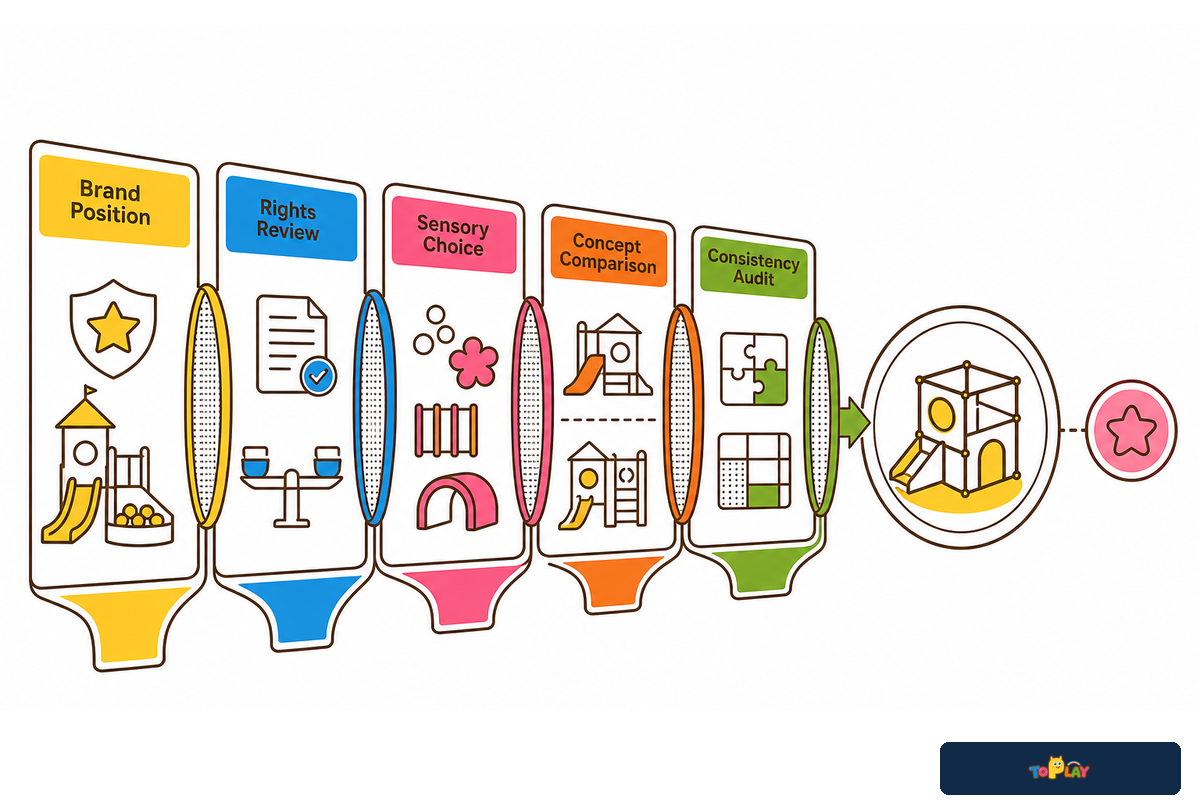
Once the creative handoff is controlled, theme lists can generate candidates, but they should not make the decision. Searches for “custom indoor playground design ideas,” “custom indoor playground design kits,” and “commercial indoor playground equipment” repeatedly surface immersive worlds, technology layers, and familiar image categories, mostly on supplier pages. That creates a rights and refresh risk because popularity does not prove brand fit, so the owner should ask which approved rule accepts the trend and which named asset can be removed later without collapsing the system.
Allow a trend to enter the design process after it has passed the brand position, rights review, sensory-choice check, concept-route comparison, and consistency audit. A current technology can be removed later; a consistent design system can lead color, naming, imagery, and character selection through the next iteration of the design.
Custom Indoor Playground Design FAQs
How do I choose the right theme for my indoor playground?
The right theme expresses the approved brand position, remains distinctive when the logo is hidden, and gives the team repeatable visual rules for later applications and approvals.
Define the audience feeling, brand behavior, proof cues, and exclusions before comparing images. Review at least two routes against brand fit, distinctiveness, extensibility, rights risk, translation risk, and refresh flexibility. A popular theme can still be the wrong choice if competitors could adopt it unchanged or if the team can’t explain which brief decisions it expresses.
What should an indoor playground design brief include?
The creative brief should define the brand position, intended audience and evidence, visual rules, asset rights, exclusions, review roles, and the person who owns each approval decision.
Include the intended feeling, brand behavior, palette hierarchy, typography, shapes and patterns, imagery rules, character files, naming voice, prohibited uses, intellectual-property status, and one owner for each decision. Mark every item approved, reference-only, missing, or prohibited. Keep site measurements, zoning, circulation, equipment, engineering, and production in their respective project documents.
How do you approve a custom indoor playground concept?
Approve the direction, visual system, touchpoint application, and creative release as four separate decisions, each with named evidence, unresolved dependencies, and one authorized decision owner.
Each review should include the current brief, round number, requested decision, files under review, unresolved dependencies, and one consolidated feedback set. A comment should identify the rule or audience outcome at risk and show the evidence. Creative release remains conditional when access, routes, components, signs, sensory choices, structures, egress, materials, rights, or local requirements await another owner.
What are the benefits of a themed indoor playground?
A coherent theme gives the team repeatable rules for graphics, names, characters, and visual cues, making concept choices easier to explain, compare, and audit across touchpoints.
Coherence makes later creative decisions easier to explain and audit. It doesn’t prove revenue, loyalty, accessibility, or child outcomes.
How much does it cost to design a custom indoor playground?
A responsible price requires the actual site, design scope, artwork and usage rights, revision rounds, equipment assumptions, technical responsibilities, production translation, and delivery responsibilities to be defined first.
“Design” may mean a light visual adaptation, original character work, a themed component, a floor-plan package, engineering coordination, or several review rounds. Those scopes aren’t comparable as one online price. Site conditions, equipment families, ownership of source artwork, new character creation, revision count, technical coordination, manufacturing translation, freight scope, and local professional services can all change what the word includes. Use this guide to prepare the owner-side creative evidence. Then request a project quotation that identifies the exact inputs assumed, files delivered, review rounds included, production changes allowed, local responsibilities excluded, and the person authorized to approve a change. Compare quotations against the same controlled brief, not against an unsupported internet price band.
The decision sequence
Position → 12-input pack → six-family visual grammar → concept routes → Brand Drift Test → ten-touchpoint consistency audit → four approval gates → controlled creative handoff. Each tool answers a different question, and none replaces professional project review.
Ready to turn an approved brand brief into a project concept?
Bring the controlled creative package, actual floor plan, open dependencies, and named approval record into a project-specific discussion. Toplay can review how the direction fits the intended equipment, design handoff, project responsibilities, and delivery scope before a quotation is prepared.
Why Toplay Published This Guide
Toplay’s public company profile describes in-house design, fabrication, upholstery, assembly, and pre-shipment testing. This article focuses on the evidence owners should control before those project-specific activities begin, especially brand inputs, rights, feedback, and conditional approvals. It doesn’t present private project metrics or guaranteed outcomes. About Toplay.
References & Sources
- Experiential Graphic Design in Physical Spaces: 2025 Review Buildings
- Trends and Approaches in Inclusive Graphic Design: 2026 Systematic Review Societies
- Guide to Inclusive Play Sensory Trust
- ADA Standards Guide: Signs U.S. Access Board
- Branded Environment Project Examples SEGD